The GitHub repo for this project.
Inspired by some discussions on the UC Berkeley Class of 2018 page on Facebook, I decided to poke around the grade distributions available on ScheduleBuilder. We go straight to some results, sparing most of the technical details; I used Python to do most of the work, and R to produce the plots.
Having scraped all grade distributions available from ScheduleBuilder (only undergraduate grades were released, except apparently for one graduate class), I determined the distribution of grades issued for each department, considering the lower division courses and upper division courses as subsets. For each pairing of department and division, I computed the average grade issued, using A+ = A = 4.0, A- = 3.7, and so on (the rest can be found here), as well as the total number of grades issued.
These are collected in a Google spreadsheet, color-coded using quartiles. Some of the interesting information we can gather from this:
- Overall average grades and number of grades reported, by division:
- Lower division: 3.23 (544653)
- Upper division: 3.32 (639588)
- Undergraduate: 3.28 (1184241)
- Departments with the lowest average grades for undergraduate courses:
- Biology (2.76) (this includes 1A, 1AL, 1B, 11, and 11L)
- Statistics (2.83)
- Mathematics (2.90)
- Departments with the highest average grades for undergraduate courses:
- Yiddish (3.94)
- Filipino (3.94)
- East European Studies (3.94)
- Departments with the most grades reported:
- Mathematics (68566)
- Chemistry (63613)
- Undergraduate Business Administration (50243)
- Departments with the least grades reported:
- Medieval Studies (12)
- Yiddish (12)
- Semitics (16)
We can see that the lowest averages belong to mostly math, science, and engineering departments (Math/Stats, Bio/Chem/Phys, ChemE/EECS/ME), with some social science departments thrown in as well (Econ, Legal Studies, American Studies). Meanwhile, the highest averages belong mostly to departments that focus on specific languages and cultures (many Asian and European languages).
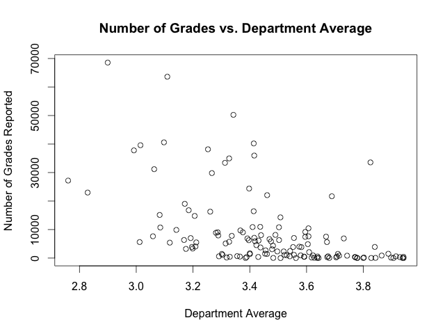
Upon further inspection, there are some possible patterns in how grade averages are related to the number of grades and whether a class is lower division or upper division. It is made quite apparent that averages for departments with many grades released are lower than the averages of those with few grades released. Indeed, the correlation coefficient between the number of grades and the department average is -0.51, indicating a moderate inverse correlation between the two variables. A scatterplot helps us visualize this relationship:
You can also see that the averages for upper division courses seem to be, on average, higher than those for lower division courses, though they are similar for many departments. To illustrate this, we perform kernel density estimation on the data, a way of estimating the frequency or density of a variable. Doing this for the distribution of department course averages, we produce the following plot:
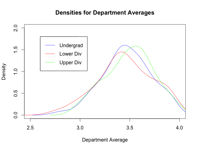
Note that the graph for the lower division data is shifted to the left of that for the upper division data, suggesting that, indeed, the lower division averages are, on average, lower (an apt descriptor).
This adventure was rather educational (getting me back up to speed on some Python libraries), with some interesting results (my majors have some of the lowest averages…). Future work that could be done includes investigating how averages and number of grades reported change with time (or rather, semester). Though this data only includes grades starting from Fall 2006, we still might (or might not) see evidence of grade inflation in the last few years.
